1/6
Product Redesign
View Project

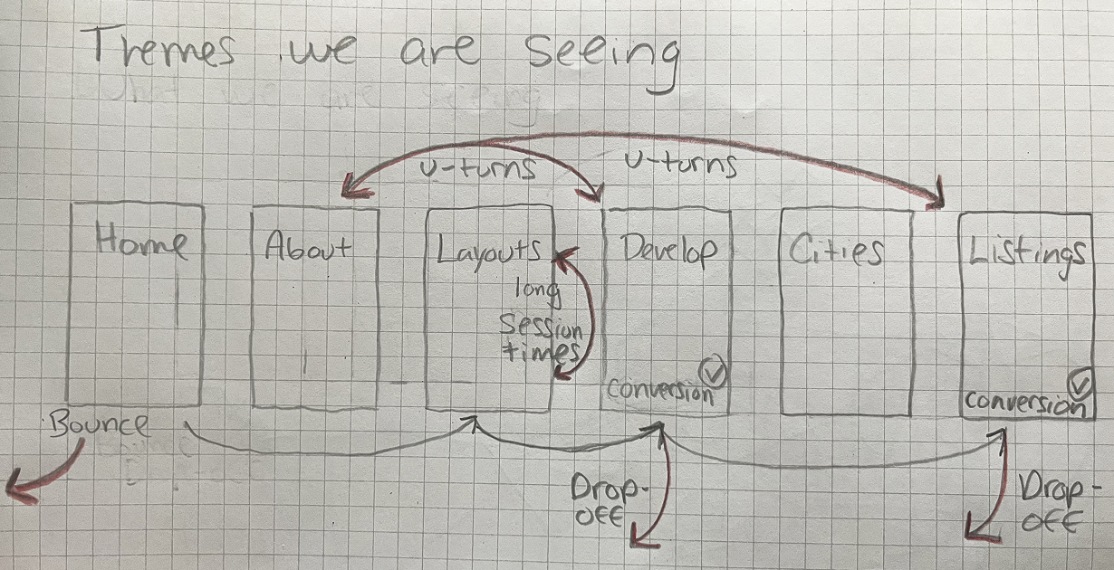
To validate these findings, I conducted moderated, think-aloud usability tests with 10 participants. In order to effectively execute and synthesize my findings I created:
- Interview guide & task flows – to better understand how users interacted with the product.
- Affinity mapping – Organizing feedback into key themes.
Findings confirmed our hypotheses: Users were unsure about what they were getting and struggled to visualize how Ori’s systems worked.
Based on research insights, I identified three areas for improvement:
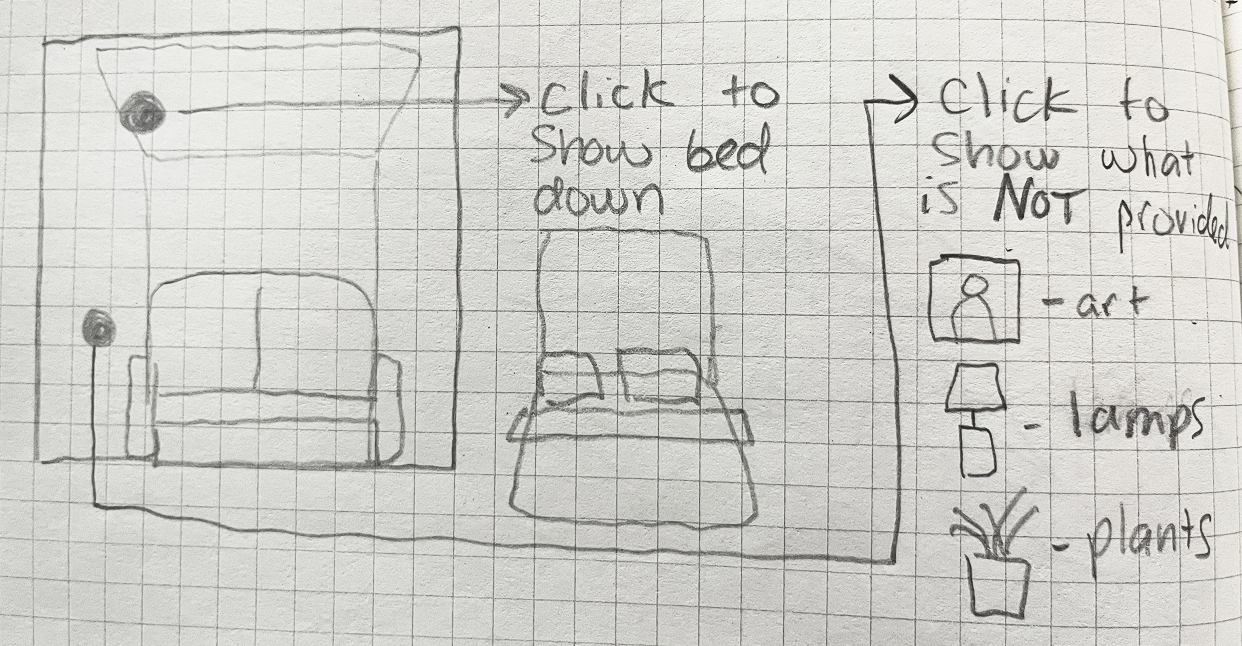
1️⃣ Show, Don’t Tell: Clarifying "Semi-Furnished" User Feedback:
Users asked:
"Does the couch count as semi-furnished?"
"I like the table—does it come with the unit?"
"I don’t own any furniture, so what exactly would I get?"
Solution: I designed an interactive UI element that clearly outlined what was included with the apartment upon move-in. Users could click on furniture items to see what was included vs. optional.
Impact: This became one of the most interacted-with sections, reducing U-turns by 90% and increasing clarity.
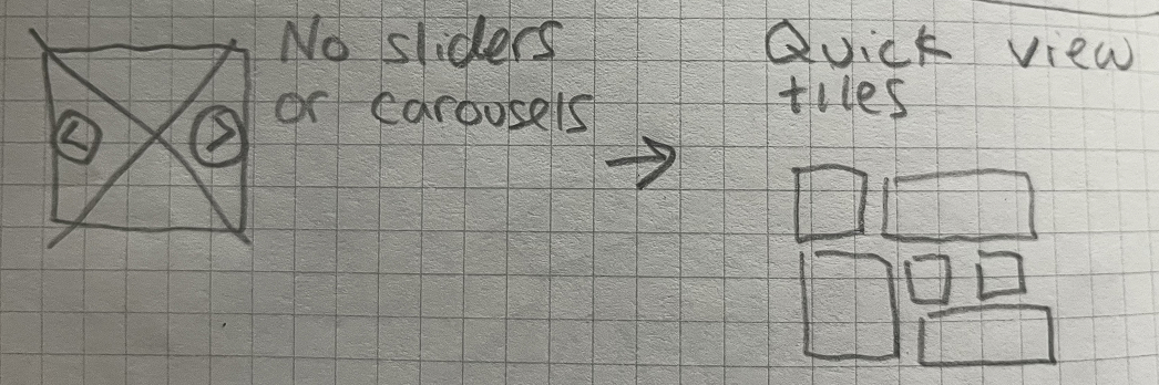
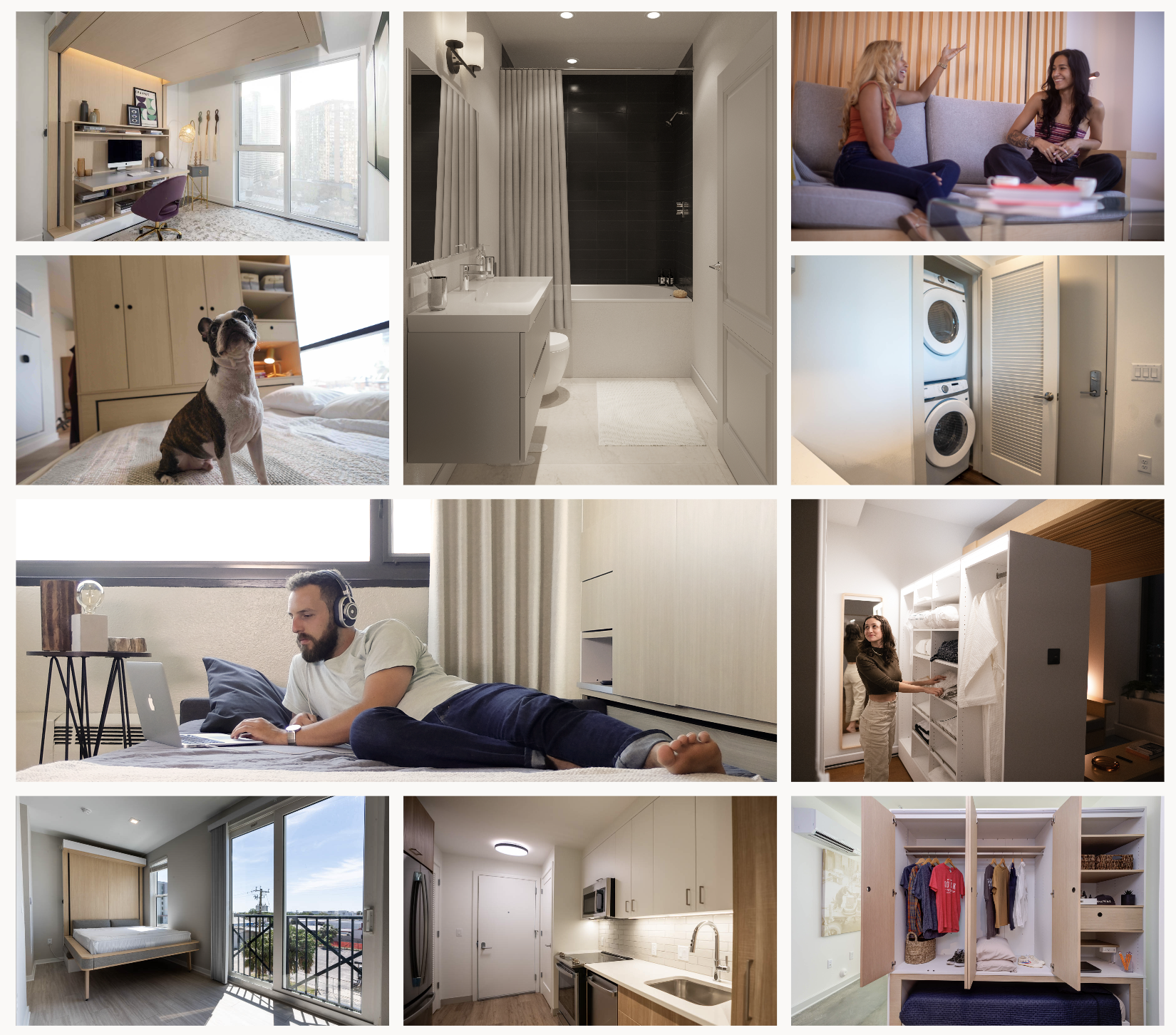
2️⃣ Highlighting Modern Amenities
Users frequently asked:
"Is there a washer and dryer?"
"What amenities are included?"
"How modern are the appliances?"
Solution: I designed an image grid showcasing in-unit amenities. This served as a way to give users a quick reference for amenities while providing more detailed information further down the funnel.
Impact: This section became the one of the most viewed sections of the website, leading to a noticeable improvement in our renter conversions.
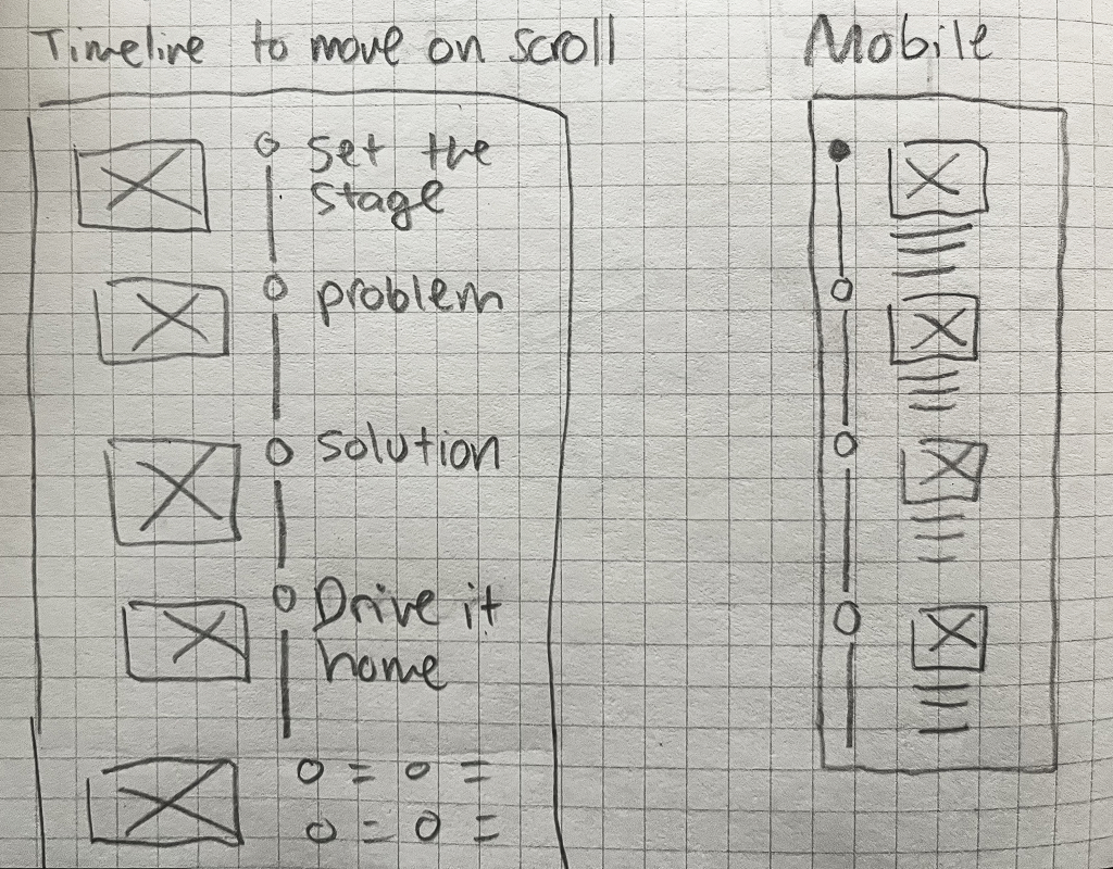
3️⃣ Building Trust Through Storytelling
Some users didn’t fully grasp the value of modular living and asked:
"Is this real?"
"Why would a small apartment be better?"
Solution: I created a timeline-style layout that walked users through the company's mission, the housing problem it solves, and why this approach matters.
Impact: This increased transparency and trust, leading to higher developer inquiries and rental sign-ups.
These updates were tested with users to verify both usability and usefulness.
Taking valuable feedback from these tests I was able to elevate these features further, build them out in Webflow, and launch the first version for our consumers.
Results & Impact
These UX improvements led to measurable success:
✅ 400% increase in CTA engagement
✅ 2.5% increase in conversions
✅ 20% decrease in drop-off rate
✅ 9% decrease in bounce rate
By leveraging visuals, interactivity, and storytelling, I transformed the website into an engaging and informative experience that effectively communicated the value of its innovative apartments.
Disrupting an industry means rethinking how you communicate unfamiliar ideas. Through user research, usability testing, and strategic UX improvements, we made the the message clearer, more compelling, and ultimately, more successful.

