2/6
Building Order From Overwhelm
View Project

Previously, the company had a narrow view of their user base, targeting late 20's to early 30's city dwellers working in tech who saw the product as functional furniture.
Through competitive analysis and 1:1 interviews, I discovered that our users are far more diverse, with varied professions, incomes, desires, needs, lifestyles, and goals. Users viewed Ori not just as functional furniture but as a solution for living the life they wanted—a real estate and lifestyle solution.
I partnered with marketing to present our findings to the team and then led a brainstorming session with multiple departments to share insights and discuss how to create consistency and relevance across our respective areas. This effort concluded with me co-managing the next steps, which involved listing tactical deliverables, prioritizing tasks, establishing timelines, and assigning them to the appropriate team members.
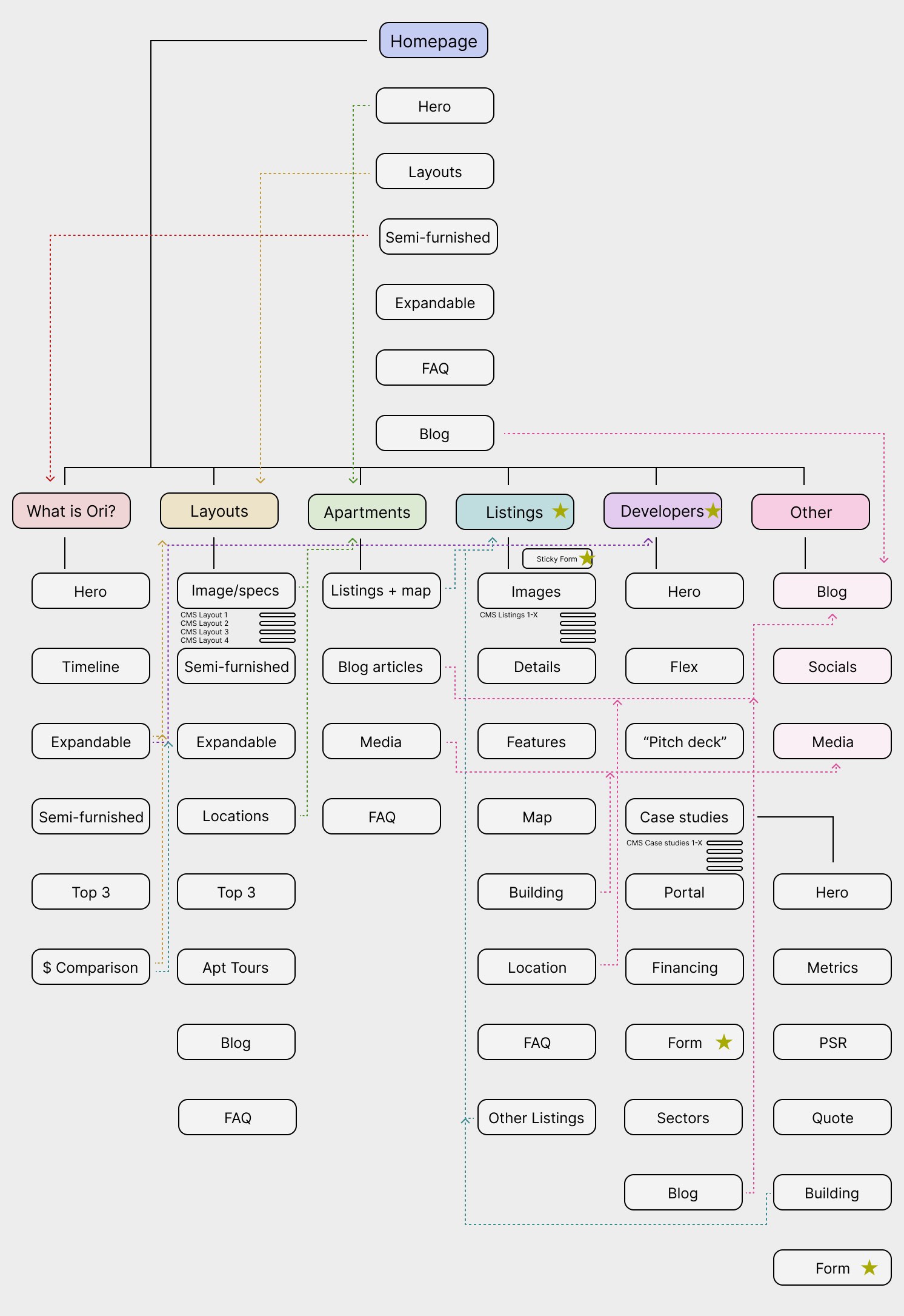
With a plan to reconvene once deliverables were submitted, I mapped out a new user journey with the guiding principle of "think apartments, not product." We learned that renters prioritized information such as price, location, layout, and amenities—details we hadn't been showcasing.
During this phase, I established and began designing an ILS infrastructure to display our offerings and facilitate user contact. This also provided clear paths for analytics, reporting, and ad retargeting. This shift from product-exclusive to real estate and lifestyle conversations also became a key reason developers wanted to collaborate with us. This allowed us to create a cohesive story in both B2C and B2C channels.
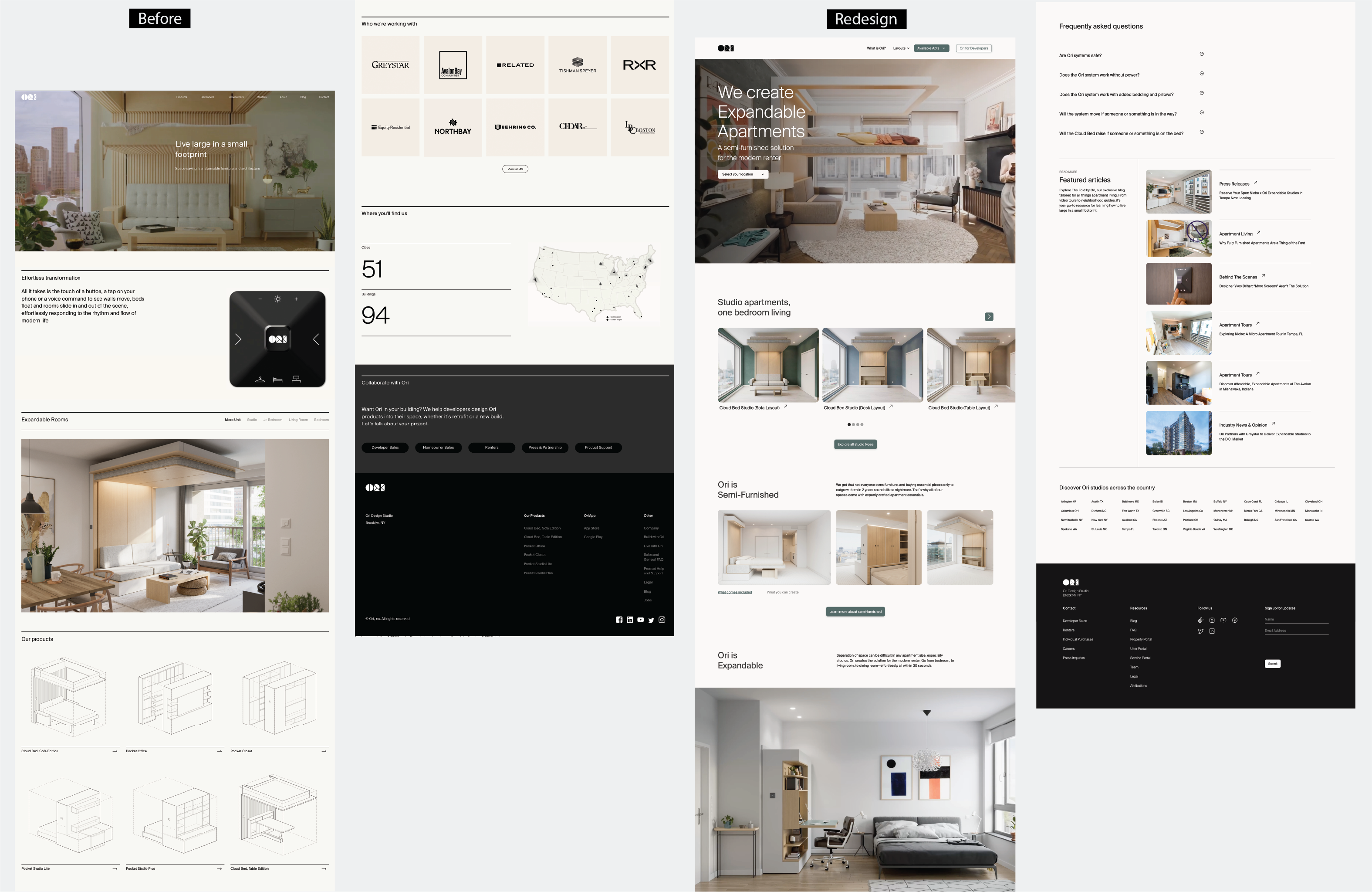
I conducted user tests after creating low-fidelity wireframes and prototypes. I usually build out prototypes in Figma, but given the fact that my team had very limited time and resources I prototyped directly in Webflow. This allowed me to leave my comfort zone, and the result was extremely rewarding. There was no hand-off / rebuild process and the turnaround to implement improvements was much shorter.
During these tests we discovered that users preferred a softer UI with rounded corners, less black and beige, more intentional CTAs, and lived-in spaces instead of schematic product drawings.
I then collaborated with internal stakeholders to update visual content, copy, and Salesforce data. With this updated content, I created high-fidelity wireframes and conducted A/B tests to identify the most successful solutions.
Throughout this phase, we encountered multiple challenges in defining a more effective user journey. However, testing guided us in the right direction. One solution reduced U-turns by 97%, and another increased conversions by 1%. By testing, I was able to align business and user goals, creating a solution that satisfied
Once the prototype was approved, I built the site in Webflow. Utilizing components created in Figma, I streamlined the development process, ensuring a cohesive and efficient build. In addition to front-end development, I played a significant role in establishing our CMS. This enabled various teams to easily manage the backend, efficiently update over 1,000 listing pages, and seamlessly integrate Salesforce data throughout the site.

✅ Exceeded B2B conversion targets by 2.5%
✅ Built in-house B2C conversion ecosystem, surpassing goals by 0.35%
✅ Drove 600% increase in CTA engagement
✅ Reduced drop-off rate by 20%

